
Designing an AI for Elder Care in Assisted Living
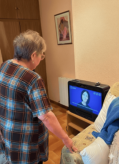
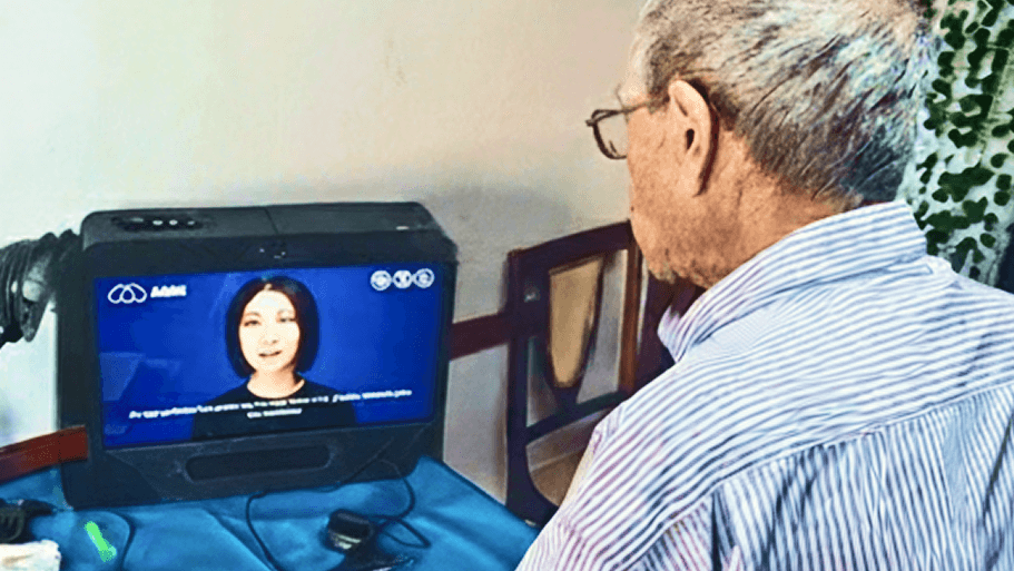
AiMA was built for assisted living environments, where elderly users face social isolation and varying cognitive abilities — and where care teams need clear, actionable visibility without added operational burden.
This wasn’t just a tablet UI challenge. We had to design trust and emotional continuity for users aged 75+, while translating AI emotional signals into monitoring and alerts that staff could act on without alert fatigue.
AiMA is an ecosystem with three connected layers:
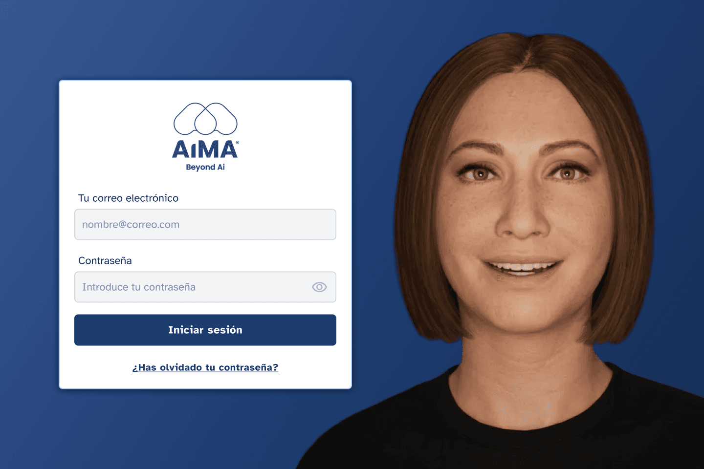
Emotional Interaction (Tablet Experience)
Clinical Monitoring & Alerts
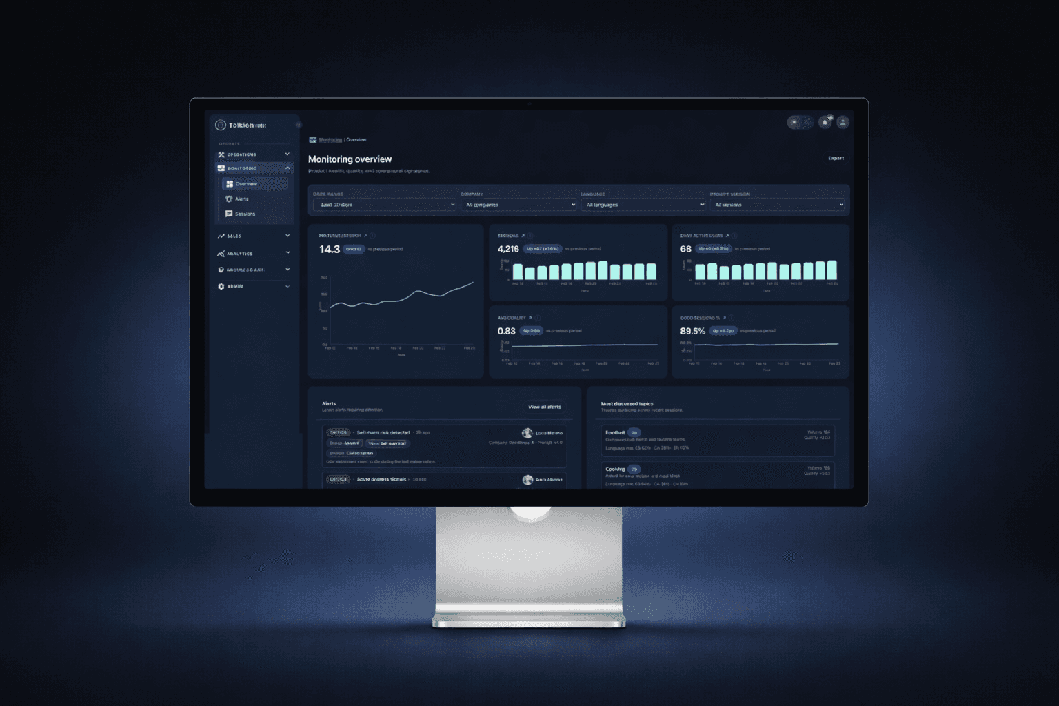
Operations Dashboard (Tolkien)

AiMA's UX is mainly based on voice interaction, but defining a holistic experience was key.
Emotional Interaction Foundations
1. Context
AiMA was designed for elderly users in assisted living environments, many of whom experience social isolation, cognitive decline, and low digital literacy.
Traditional conversational interfaces are not built for users aged 75+. They often rely on complex UI patterns, fast-paced interactions, and abstract system feedback that can generate confusion or mistrust.
The goal was to design a calm, intuitive, and emotionally safe AI interaction that elderly users could adopt naturally — without feeling overwhelmed or intimidated.
2. Research
We conducted contextual research in assisted living environments, observing how elderly residents interacted with technology and how care staff supported them.
This included:
Observing real tablet usage behaviors
Identifying cognitive friction points
Understanding emotional triggers and trust signals
Mapping attention span and interaction rhythm
We also analyzed conversational design best practices and accessibility guidelines to ensure the experience would accommodate visual, auditory, and cognitive limitations.

3. Challenge
The main challenge was balancing emotional warmth with extreme simplicity.
We needed to:
Build trust in an AI system among vulnerable users
Reduce cognitive load to the minimum
Avoid visual noise and unnecessary controls
Provide clear system feedback (listening, thinking, speaking)
Ensure the interaction felt human but not deceptive
Additionally, the system had to work reliably in shared care environments, where interruptions and external noise were common.
4. Design Process
We defined a minimal interaction model based on three primary states:
Listening - Processing - Speaking
The interface was reduced to essential elements:
A central conversational area
Clear visual feedback for system state
A prominent “End Conversation” action
A simple text confirmation input
We iterated on visual density, typography scale, contrast, and spacing to ensure readability and calmness.
Prototypes were tested in real environments, and adjustments were made to pacing, button size, and system feedback clarity.
The result was an interaction model focused on emotional continuity rather than feature richness.
5. Collaboration with Other Teams
I worked closely with:
AI engineers to define system states and feedback timing
Care staff to validate usability in real scenarios
Developers to ensure interaction states were technically feasible
Stakeholders to align emotional goals with product strategy
Workshops and iterative reviews helped refine the balance between emotional design and operational constraints.
6. Results and Metrics
After deployment in pilot residences:
+33% increase in weekly interactions per user
75% of users returned to the system for consecutive sessions
+25% average session duration
66% of care staff reported improved perceived emotional engagement
The simplified interface reduced onboarding time and increased confidence among first-time users.
7. Final Conclusion
This project allowed New Relic to have a much more cohesive platform, where users could navigate more smoothly across different parts of the application. The established design language also created a solid foundation for future projects, improving team collaboration and accelerating development.
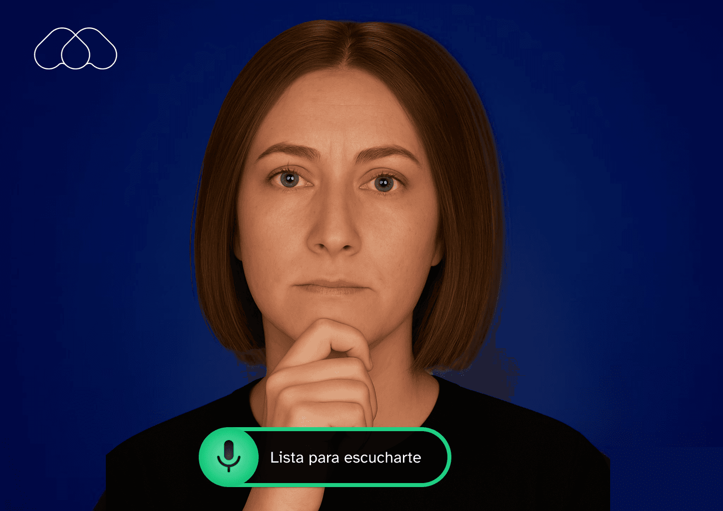
This was an earlier UI concept, using gestures and on-screen controls to reflect AiMA’s state and app status.
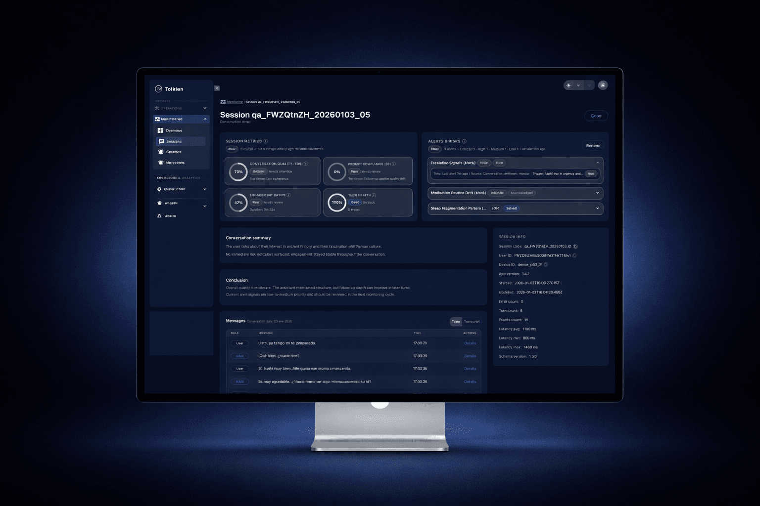
Tolkien Platform Foundations
1. Context
As AiMA scaled from pilot deployments to multiple assisted living sites, we needed a single platform to operate the service end-to-end.
Tolkien became the control center for:
· Internal operations (devices, installations, sessions, incidents, QA)
· Clinical visibility (alerts, resident status, trends)
· Customer access (care managers and client teams) with role-based permissions
The goal was to build a system that could support day-to-day operations while also giving clients trustworthy, self-serve insight into their residents’ wellbeing and alert history.
2. Research
We mapped workflows across two distinct user groups:
Internal teams
Operations, support, QA, and product
Need: speed, debugging clarity, full access, auditability
Client teams
Care managers and supervisors
Need: clarity, trust, minimal noise, and privacy-safe views
We analyzed common failure points in monitoring tools:
Overly technical dashboards
Alert fatigue
Lack of context (why an alert happened)
Poor permission models that break trust
This research informed a dual-mode platform: operational depth for internal users + simplified clinical insight for clients.
3. Challenge
The biggest challenge was designing one platform for two audiences with conflicting needs:
Internal users needed full control and technical detail
Clients needed simplified, actionable insights
Both required trust, traceability, and privacy safeguards
We also had to ensure the platform scaled across multiple residences and deployments without becoming a maze of entities, filters, and exceptions.
4. Design Process
We structured Tolkien around a clear hierarchy:
Resident / Patient → Sessions → Signals → Alerts → Actions
Key design decisions:
A monitoring layer centered on sessions, quality score, and alert signals
Fast filtering and searching (by status, time range, quality indicators)
Alert states designed for actionability (open, acknowledged, resolved)
A “resident snapshot” pattern to summarize mood, vitals (when available), medication, and recent alerts
Role-based access patterns to expose the right level of detail to clients without operational noise
We iterated heavily on information density, scannability, and permission-aware UI states (what’s visible, what’s editable, what’s audit-logged).
5. Collaboration with Other Teams
I worked closely with:
Engineers to align entity models, permissions, and scalable UI architecture
Ops/support teams to validate real workflows and edge cases
Clinical/care stakeholders to validate alert usefulness and interpretation
Leadership to define what should be customer-facing vs internal-only
We reviewed iterations using real scenarios (a device failure, a low-mood alert, a conversation quality drop) to ensure the platform supported day-to-day decision making.

6. Results and Metrics
After adoption in production workflows:
-40% reduction in time to investigate incidents and alerts
+50% faster triage due to improved filtering and resident snapshots
90% of client stakeholders could self-serve key insights without requesting internal support
Significant reduction in “false urgency” thanks to clearer alert resolution states
Tolkien became the shared source of truth for operational status and resident wellbeing monitoring.
7. Final Conclusion
Tolkien turned AiMA into an operable, scalable service — not just a conversational experience.
By designing a permission-aware platform that supports both internal operations and client visibility, we enabled trustworthy monitoring, faster response to risk signals, and a scalable foundation for future deployments.
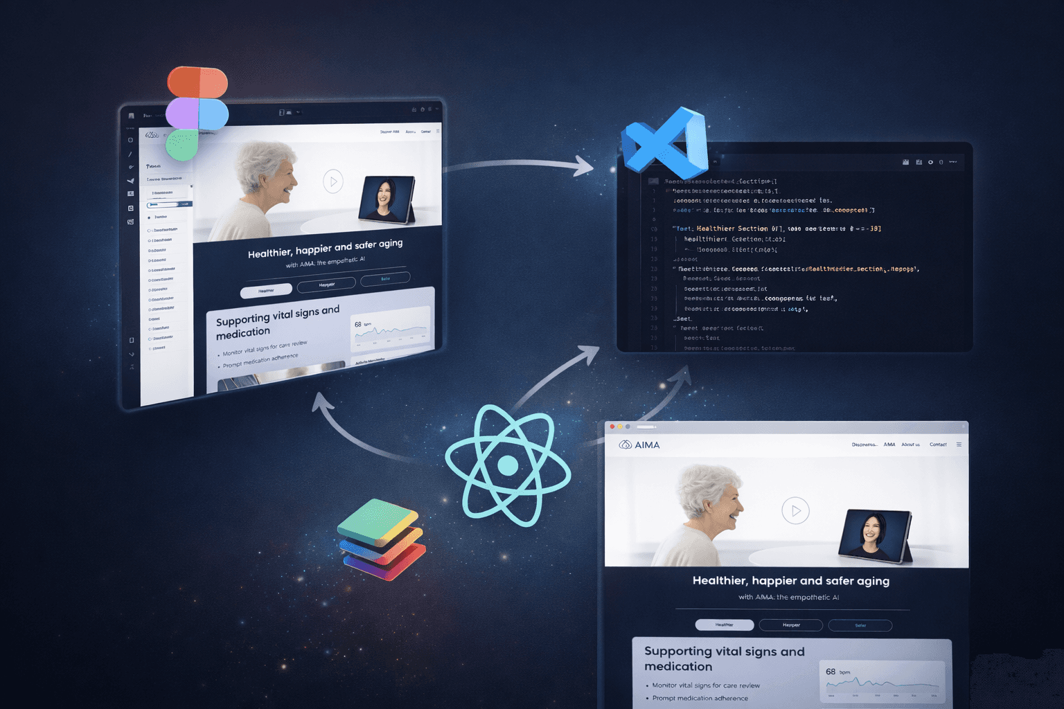
AI-Augmented Product Delivery
1. Context
As AiMA evolved, we needed to accelerate how design decisions moved from Figma to production.
Traditional handoffs were slowing iteration cycles and introducing inconsistencies between design and implementation. At the same time, we were building both a marketing landing and product-facing interfaces that needed tight alignment with the system architecture.
The goal was to reduce friction between design and development while maintaining quality and consistency.
2. Research
We analyzed our existing workflow:
Static handoff files in Figma
Manual translation of components into code
Inconsistent token usage
Repeated UI implementation work
We explored emerging AI-assisted workflows and tooling that could connect design systems directly with codebases, including MCP-based integrations and AI copilots inside VS Code.
The opportunity was clear: reduce iteration time without compromising design intent.
3. Challenge
The main challenge was building a workflow that:
Preserved design system integrity
Reduced implementation time
Avoided “AI-generated chaos”
Kept developers in control of architecture
Enabled rapid UI iteration
We also needed to ensure that AI-assisted generation produced production-ready components, not throwaway prototypes.
4. Design Process
We implemented an AI-augmented workflow structured around:
1. Structured Design in Figma
Tokens for color, spacing, typography
Componentized UI patterns
Clear hierarchy and naming
2. MCP Integration
Direct linkage between Figma and repository structure
Component-level alignment
3. Codex in VS Code
Assisted generation of UI components
Rapid iteration on layout and responsiveness
Reduced boilerplate
4. Iterative Validation
Manual review and refinement
Alignment with system architecture
E2E validation when needed
This workflow was used to build the new AiMA landing and accelerate internal UI iteration.
5. Collaboration with Other Teams
I worked closely with developers to:
Define how tokens map to code
Review generated components
Maintain architectural integrity
Establish guardrails for AI-assisted generation
Instead of replacing engineering effort, the system augmented it — reducing repetitive implementation work while preserving ownership.

6. Results and Metrics
-30% reduction in UI implementation time
Significant decrease in visual inconsistencies
Faster landing page iteration cycles
Improved alignment between design system and production components
The workflow also reduced dependency bottlenecks between design and development.
7. Final Conclusion
This AI-augmented delivery model allowed us to move from traditional handoff to collaborative iteration.
By connecting structured design systems with AI-assisted development, we accelerated product evolution while maintaining control and quality.
This approach reflects a broader shift in how modern product teams can operate at speed — without sacrificing design integrity.